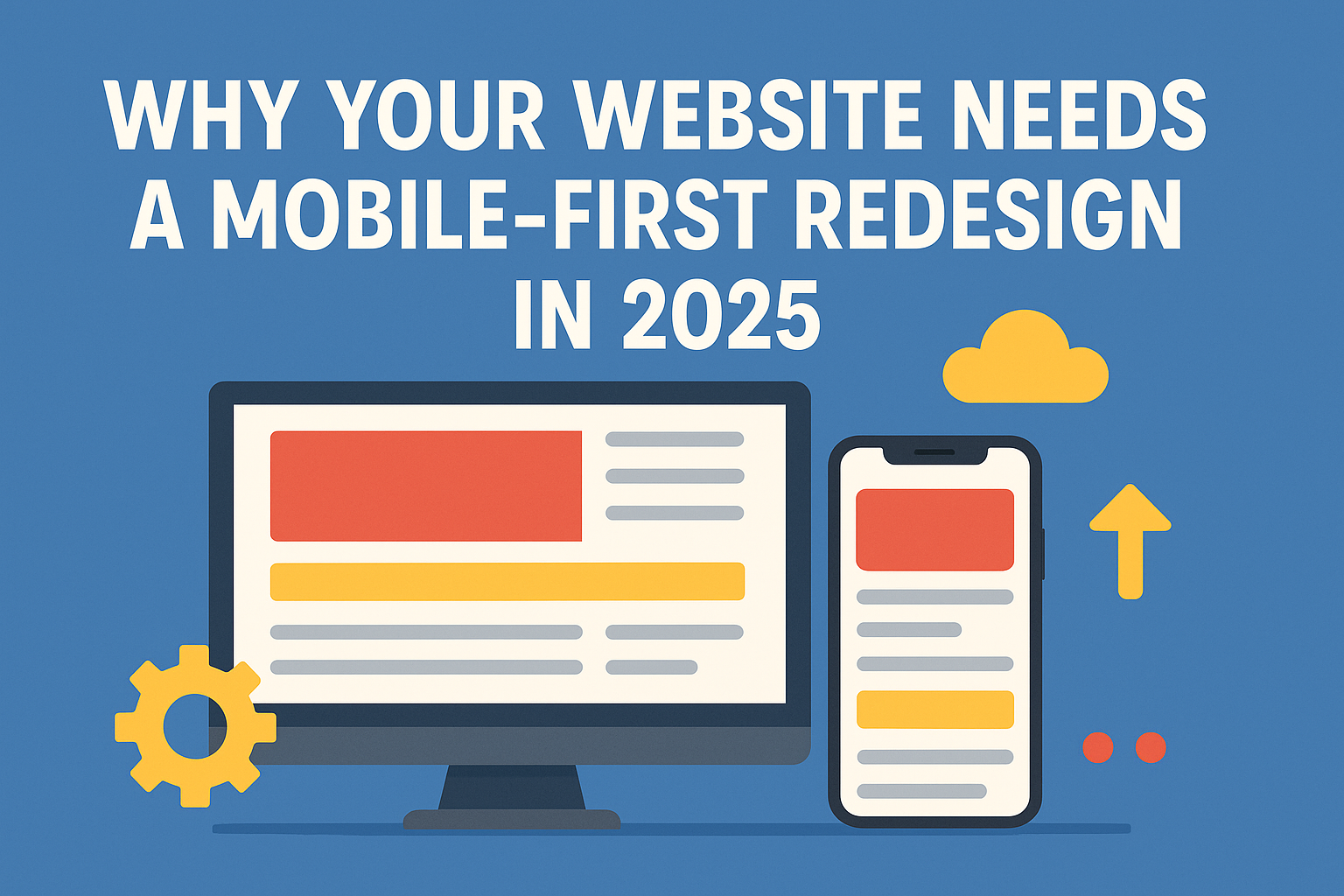
In today’s hyper-connected world, a sleek, mobile-optimized website isn’t a luxury anymore—it’s the standard. As we step deeper into 2025, businesses that haven’t embraced a mobile-first approach are not just lagging; they’re risking their entire digital presence.
Gone are the days when designing for desktop and shrinking it for mobile screens was enough. Mobile-first is no longer a trend—it’s the baseline expectation. If your website still looks clunky or loads slowly on a smartphone, it’s time for a serious redesign. Let’s dive into why a mobile-first redesign is crucial for success in 2025.
1. Mobile Usage Has Overtaken Everything Else
It’s official: mobile traffic dominates the internet. Studies show that over 70% of web traffic now comes from mobile devices. Whether it’s shopping, booking services, reading news, or browsing social media, people are glued to their smartphones.
If your website isn’t mobile-friendly, you’re instantly alienating the majority of your audience. And it’s not just about looking good—it’s about functionality. A tiny button here or a hard-to-read font there can cost you a lead, a sale, or a customer.
Key takeaway:
Design for the devices your customers actually use.
2. Google’s Mobile-First Indexing is Now Standard
Back in 2018, Google started rolling out mobile-first indexing, but by 2025, it’s the norm across the board. What does this mean? Google predominantly uses the mobile version of your website for indexing and ranking.
In simple terms:
- If your mobile site is slow, poorly designed, or incomplete, your SEO will suffer.
- A mobile-first website isn’t just about user experience anymore—it’s critical for visibility.
If your competitors are optimized for mobile and you aren’t, they’ll outrank you, no matter how great your desktop site is.
Key takeaway:
Mobile-first design = better search rankings = more traffic.
3. User Expectations Are Higher Than Ever
Today’s consumers expect instant, seamless experiences. Thanks to apps and mobile-friendly giants like Amazon and Uber, users are conditioned to expect fast loading times, intuitive navigation, and effortless interactions.
If your site takes longer than three seconds to load or requires awkward zooming and pinching to navigate, expect high bounce rates. Users don’t wait around—they move to a competitor.
In 2025, user patience is non-existent. Your website must feel natural and frictionless on mobile screens.
Key takeaway:
Deliver an intuitive, fast, and flawless mobile experience—or lose customers.
4. Mobile Commerce is Exploding
E-commerce through mobile devices—known as m-commerce—has seen meteoric growth. Whether it’s ordering groceries, shopping for clothes, or booking vacations, transactions are happening on mobile.
In fact, mobile commerce sales are projected to account for over 70% of total e-commerce sales by the end of 2025.
If your site isn’t mobile-first, you’re not just losing visitors—you’re losing revenue.
Key takeaway:
Your checkout process must be seamless on mobile to capture sales opportunities.
5. Future Technologies Are Mobile-Driven
Emerging technologies like augmented reality (AR), voice search, and mobile wallets are all designed with mobile users in mind.
- Think of trying on glasses virtually using your phone camera.
- Or searching for a product by speaking into your mobile device.
- Or completing a purchase instantly with Apple Pay.
If your website isn’t optimized for mobile experiences, you won’t be ready to integrate these future tech advancements—meaning you’ll be left behind.
Key takeaway:
Future-proof your brand with mobile-first readiness.
6. Mobile-First Enhances Brand Perception
Your website is often your brand’s first impression. A poor mobile experience sends a clear (and damaging) message:
- Outdated.
- Unreliable.
- Not customer-focused.
On the other hand, a beautiful, fast, mobile-optimized site positions you as modern, credible, and trustworthy.
In a competitive market, perception can be everything. Would you trust a company whose website looks broken on your phone? Neither would your customers.
Key takeaway:
Your mobile site is your brand’s handshake—make it firm and impressive.
7. Mobile-First is Cost-Effective in the Long Run
It might feel like a big investment upfront to redesign your website for mobile-first. But long-term? It’s far more cost-effective.
Here’s why:
- Reduced bounce rates = better ad ROI.
- Higher conversion rates = more sales without increasing ad spend.
- Fewer redesigns down the road as new devices and tech emerge.
A mobile-first approach is scalable and flexible, meaning your website can evolve without major overhauls every year.
Key takeaway:
Investing in mobile-first now saves money (and headaches) later.
What Should a 2025 Mobile-First Website Include?
If you’re planning your mobile-first redesign, make sure you focus on:
- Speed optimization: Images compressed, code cleaned.
- Thumb-friendly navigation: Big, easy-to-tap buttons.
- Minimalist design: Clutter kills mobile experiences.
- Clear CTAs: Make the next step obvious.
- Voice search compatibility: Prepare for verbal queries.
- Mobile-first forms: Short, sweet, and simple.
Final Thoughts: The Future is Already Here
In 2025, a mobile-first website isn’t a competitive advantage—it’s the price of entry.
Brands that prioritize mobile-first experiences are winning hearts, minds, and wallets. Those that don’t? They’re fading into digital irrelevance.
If you want your business to thrive in the mobile era, the time to act is now. Not tomorrow. Not next quarter. Now!
Website redesign with a mobile-first mindset—and build a future where your brand stays ahead, no matter what the digital world throws your way.