Typography, often seen as a subtle design element, holds a significant role in user experience (UX) design. While many may overlook its importance, the selection of fonts, spacing, and type hierarchy can shape the way users perceive and interact with a product. In the digital world, where user interaction with websites, apps, and digital platforms is instant and fleeting, typography’s role in UX has never been more crucial. From readability to emotion, brand perception to navigation, typography can either make or break a user’s experience.
1. First Impressions: Typography as a Visual Gatekeeper
The first interaction users have with a digital product is often visual. Before they read the content or explore the features, typography sets the tone. The font style, size, and spacing can evoke feelings of professionalism, playfulness, elegance, or urgency. It serves as a gatekeeper, providing an immediate sense of trust or disinterest.
For example, serif fonts (fonts with small strokes or extensions at the end of letters) like Times New Roman are often associated with tradition, trustworthiness, and formality. In contrast, sans-serif fonts (without those strokes) such as Helvetica or Arial are seen as modern, clean, and approachable. By choosing the right font style, brands can create a strong first impression that aligns with their message.
2. Readability and Legibility: User Comfort Comes First
The primary role of typography is to ensure that the content is easy to read and understand. Readability refers to how easily a user can scan and comprehend large chunks of text, while legibility concerns the clarity of individual letters and words.
Factors influencing readability and legibility include:
- Font Size: Too small or too large, and users struggle to focus. A balanced font size ensures users don’t have to zoom in or out.
- Line Spacing (Leading): Proper space between lines makes the content more breathable, reducing eye strain.
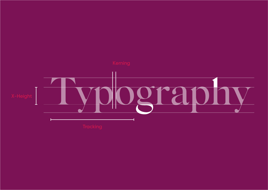
- Letter Spacing (Kerning): Adjusting the space between characters can enhance the smoothness of reading, especially for longer paragraphs.
Well-chosen typography improves the user experience by minimizing cognitive load, allowing users to effortlessly consume content. For example, websites aimed at older audiences often choose larger fonts and increased line spacing to accommodate users with vision challenges.
3. Hierarchy: Guiding the User’s Attention
One of the key principles of good UX is guiding the user’s journey through the interface in a structured, logical way. Typography plays an essential role in this by establishing a visual hierarchy, which helps users prioritize information.
Effective use of typography hierarchy includes:
- Headlines: Bold, large fonts for headlines catch the user’s attention immediately. Headlines provide an overview and entice users to delve deeper into the content.
- Subheadings: Subheadings break content into digestible chunks, making it easier for users to scan the page and find the information they need quickly.
- Body Text: The main content should be readable and comfortable to process without distracting embellishments.
- Call-to-Action (CTA): Typography on buttons and CTAs needs to stand out but not feel overwhelming. Bold and contrasting fonts help guide users toward actions like “Sign Up” or “Buy Now.”
By using different font sizes, weights, and styles strategically, designers can direct the user’s focus to key areas, enabling smoother navigation and interaction with the digital product.
4. Emotional Resonance: Conveying Brand Personality and Tone
Typography not only conveys information but also emotion. Just as colors and images can evoke specific feelings, fonts have their own personalities. This emotional resonance is essential for creating a cohesive brand experience.
For instance:
- Bold, playful fonts might communicate a sense of creativity and fun, which would suit a children’s toy company.
- Minimalist, sleek fonts might convey professionalism and sophistication, fitting for a tech or luxury brand.
Additionally, font weight (bold, light, regular), italics, and capitalization can all influence how a message is perceived emotionally. A product description in a bold, all-caps font may feel urgent or commanding, while the same message in a light, lowercase font may come across as relaxed and informal.
Aligning typography with the brand’s tone of voice ensures that users have a consistent and immersive experience that reinforces the brand’s values and message.
5. Accessibility: Inclusivity through Typography
Accessibility is a fundamental aspect of UX design, ensuring that all users, regardless of ability, can effectively engage with a product. Typography plays a key role in ensuring that digital content is accessible to users with different needs.
Designing for accessibility through typography includes:
- Choosing Readable Fonts: Fonts that are overly decorative or ornate can be difficult for users with visual impairments to read.
- Sufficient Contrast: Text should have enough contrast with the background to be easily readable, especially for users with low vision or color blindness. The Web Content Accessibility Guidelines (WCAG) recommend a contrast ratio of at least 4.5:1 for normal text.
- Responsive Typography: As users engage with content across different devices (mobile, tablet, desktop), responsive typography adjusts the font size and spacing for optimal readability.
- Adjustable Text: Allowing users to resize text or use screen readers ensures that content is accessible to all.
A focus on accessible typography broadens the usability of a product, demonstrating inclusivity and increasing user satisfaction.
6. Reducing Cognitive Load: Simplifying Decision Making
In UX, cognitive load refers to the mental effort required to process information. High cognitive load can frustrate users, leading them to abandon a website or app. Poorly designed typography can contribute to increased cognitive load by making the content difficult to read or understand.
Clear, concise typography simplifies decision-making by guiding the user to essential information. Consistent use of font styles across a website—such as using the same font for all headlines or body text—helps users intuitively understand the structure of the content without needing to pause and decode the design.
When users can quickly and easily interpret information, they are more likely to complete tasks such as signing up for a newsletter, making a purchase, or navigating to another page.
7. Consistency: Building Trust and Brand Identity
Typography is a powerful tool for creating consistency across a digital product. Consistent typography across all pages and platforms builds trust and helps establish a strong brand identity. Users subconsciously recognize and become familiar with fonts associated with certain brands, leading to a sense of reliability and professionalism.
For example, many top brands—like Google, Apple, and Nike—use custom or proprietary fonts that are instantly recognizable. These fonts become part of the brand’s identity, contributing to user trust and brand loyalty.
Consistency also applies to typography spacing, alignment, and color schemes, ensuring that users experience a seamless flow as they navigate through different pages or sections of a product.
Conclusion
While typography may seem like a subtle design element, its impact on user experience is anything but quiet. From readability and accessibility to emotional resonance and brand consistency, typography shapes the way users interact with digital products. Thoughtfully chosen fonts, spacing, and hierarchies create a harmonious and intuitive experience, guiding users seamlessly from one interaction to the next. In today’s digital landscape, where user attention is fleeting, typography can make all the difference between an engaged user and a frustrated one. Understanding and leveraging the power of typography is not just about aesthetics—it’s about enhancing user satisfaction, driving conversions, and ultimately contributing to the overall success of a digital product.