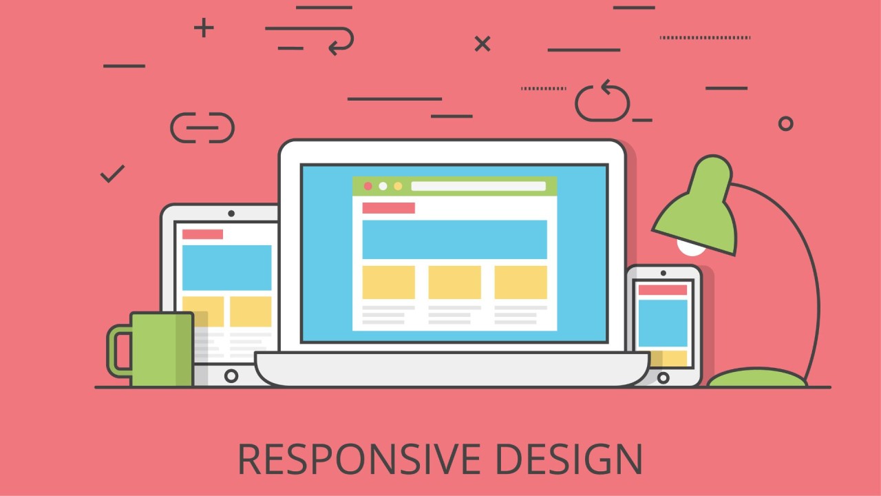
In today’s fast-paced digital world, a business’s online presence plays a crucial role in its success. With the increasing reliance on mobile devices, having a website that adapts seamlessly to different screen sizes is no longer an option—it’s a necessity. This is where responsive web design comes in.
A responsive website enhances user experience, improves search engine rankings, and increases conversions, making it a game-changer for any brand. If your website isn’t responsive, you may be losing potential customers without even realizing it. Let’s explore why responsive web design is essential and how it can transform your brand’s online presence.
What Is Responsive Web Design?
Responsive web design (RWD) is an approach to web development that ensures a website adapts to different screen sizes and devices. Whether a user visits your site from a smartphone, tablet, laptop, or desktop, a responsive design ensures that the layout, images, and content adjust accordingly for an optimal viewing experience.
Instead of creating separate versions of a website for different devices, responsive design uses flexible grids, images, and CSS media queries to create a single site that works smoothly across all platforms. This not only improves usability but also makes website maintenance easier and more cost-effective.
The Importance of Responsive Web Design
1. Enhanced User Experience
User experience (UX) is one of the most critical factors in determining the success of a website. If visitors find your site difficult to navigate or content doesn’t display properly on their device, they are likely to leave within seconds.
A responsive design ensures that:
- Text is easy to read without zooming or scrolling horizontally.
- Navigation menus are accessible and functional on all devices.
- Buttons and interactive elements are appropriately sized for touchscreens.
By providing a seamless and enjoyable experience, responsive web design helps reduce bounce rates and increases the likelihood of visitors engaging with your content.
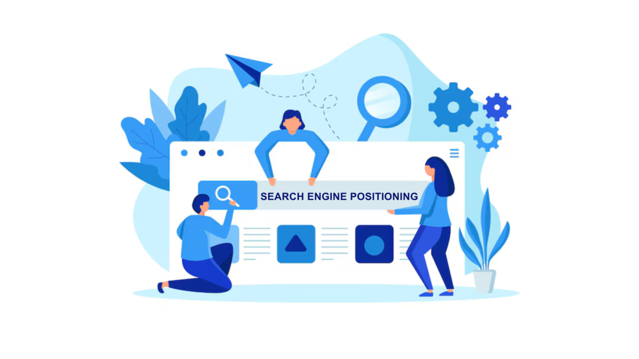
2. Improved SEO and Higher Search Rankings
Search engines, particularly Google, prioritize mobile-friendly websites in their search results. Google’s mobile-first indexing means that the mobile version of your site is considered the primary version when ranking pages.
A responsive website benefits SEO by:
- Improving site usability and engagement metrics.
- Reducing duplicate content issues that arise from having separate mobile and desktop sites.
- Enhancing page loading speed, which is a crucial ranking factor.
If you want your brand to appear at the top of search engine results, investing in a responsive web design is a must.
3. Increased Mobile Traffic
With over 60% of internet traffic coming from mobile devices, it’s essential to cater to this audience. If your website is not mobile-friendly, you risk losing a significant portion of your potential customers.
A responsive website ensures that mobile users can easily access your content, navigate pages, and complete actions like filling out forms or making purchases. This translates to higher engagement and increased conversions.
4. Better Conversion Rates and Sales
A well-optimized, responsive website can significantly boost conversion rates. When users have a smooth experience, they are more likely to complete desired actions, such as:
- Making a purchase
- Subscribing to a newsletter
- Filling out a contact form
E-commerce websites, in particular, benefit greatly from responsive design. If customers struggle with navigation or encounter issues during checkout, they are likely to abandon their carts. A seamless mobile shopping experience can lead to higher sales and customer satisfaction.
5. Cost and Time Efficiency
In the past, businesses had to create separate websites for desktop and mobile users, which required extra time, effort, and resources. With responsive design, you only need to maintain one site that works across all devices, reducing development and maintenance costs.
Additionally, making updates and changes becomes easier, as they are applied universally rather than having to modify multiple versions of the site.
6. Competitive Advantage
If your competitors are already using responsive web design and you’re not, you may be falling behind. A non-responsive website can give users a frustrating experience, causing them to switch to a competitor with a mobile-friendly site.
By investing in responsive design, you demonstrate professionalism, credibility, and a commitment to providing the best user experience—helping you stand out in a competitive market.
7. Future-Proofing Your Website
Technology is constantly evolving, and new devices with varying screen sizes continue to emerge. A responsive website is built to adapt to future technological advancements, ensuring your brand remains relevant and accessible to all users.
How to Implement Responsive Web Design
If you’re ready to upgrade your website to a responsive design, here are some essential steps to follow:
1. Use a Mobile-First Approach
Since mobile traffic is dominating the web, designing your website with a mobile-first mindset ensures that the smallest screen size is prioritized before scaling up for larger devices.
2. Utilize Flexible Grids and Layouts
Use CSS Grid or Flexbox to create flexible layouts that automatically adjust based on screen size, ensuring a consistent look and feel across devices.
3. Optimize Images and Media
Large images can slow down your website. Use responsive image techniques like srcset and CSS media queries to deliver the right image size for different devices, improving load times.
4. Implement Touch-Friendly Elements
Ensure buttons, links, and forms are large enough to be tapped easily on mobile screens. Avoid elements that require precise clicking, as they can frustrate users on touchscreens.
5. Test Across Multiple Devices
Before launching your website, test it on various screen sizes and devices to ensure it functions properly. Tools like Google’s Mobile-Friendly Test, BrowserStack, and responsive design mode in Chrome DevTools can help.
6. Focus on Speed and Performance
Optimize page loading speed by:
- Minimizing CSS and JavaScript files
- Enabling browser caching
- Using a content delivery network (CDN)
Conclusion
Responsive web design is no longer an optional feature—it’s a necessity for any brand that wants to succeed in the digital age. By ensuring your website adapts to all devices, you improve user experience, boost SEO rankings, increase mobile traffic, and enhance conversion rates.
If your website isn’t responsive yet, now is the time to make the change. Investing in a responsive design will future-proof your business, help you stay competitive, and ensure your audience enjoys a seamless browsing experience across all devices. Don’t let an outdated website hold your brand back—embrace responsive web design and watch your business thrive!